Balance
by Victor Carrasco
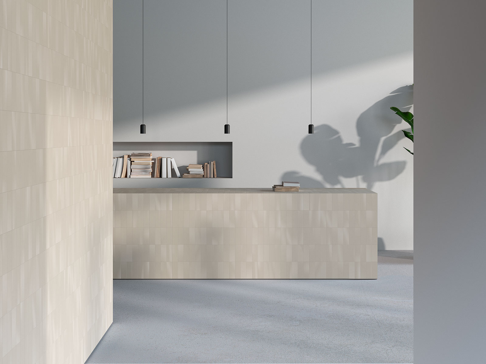
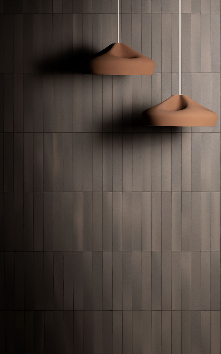
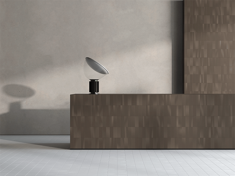
Balance consist of gently swaying from side to side. Light is subtly applied onto materials to create a collage of sinuous lights and shadows. A timeless and somewhat unexpected collection; its main objective is to create noble spaces. Elegance emerges through the lights and shadows with great subtlety; reflecting its way through the piece, producing a subtle yet natural finish. The incidence of light is represented in the different formats, creating a certain relationship between the combination of the different pieces and finishes. Luminosity and opacity are reflected in this collection, these are brought together and supplement one another through their contrasting yet connecting tonalities.

In architectural design, importance has always been placed on letting light reach where it is needed most. Light becomes the protagonist of the piece, enabling shadows to emerge, reflecting a mixture of light and dark tonalities and textures. A certain poetry is reflected and defined through these contrasts, highlighting every individual detail in this dance of shadows.
In the BALANCE collection all of the superfluous and redundant elements have been eliminated and the pieces which make up this collection are defined by their exquisite design, which represents both the heart and soul of the light; an element which despite being so simple, brings great value to the space it complements. Through its well-thought out study of gradients, this collection looks to reflect the real power of this piece, using intensity to turn it into a truly unique element.
The base is formed from an imaginary grid upon which the pieces are combined. They have two different surfaces: one smooth and one with a bevel along one of the piece’s sides which creates a slightly oversized mosaic effect in the set. The combination of both pieces makes lines of different intensities on the surface, providing many composition possibilities.
A collection open to ideas, creativity and diversity. And which reminds us that designing is investigating, experimenting and feeling. Enjoy the experience.


